How can we know what a team's principal source of threat in attack is? Is it from quick counterattacks, patient build up play in and around the box, or overloading players on a flank and playing long balls in behind? These questions can be answered by some metrics which Footovision created in the past, like the event pitch selector, which allows you to select the starting and finishing areas of events (such as seeing where a player started their dribble and where they were dispossessed), but these do not provide comprehensive answers for when multiple events (like shots, passes and dribbles all happening in the same attack) require tracking. Our solution is the Playing Areas Summary widget.

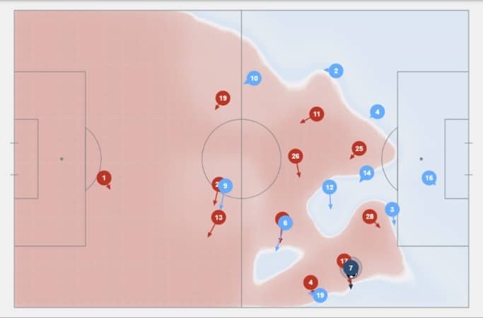
The Player Areas Summary is a dynamic widget that visualizes different events of a team (or a player) according to the areas of the field they are in. By applying this widget over the course of a season, an analyst can draw significant conclusions. For instance, if Thomas Tuchel thought that Christian Pulisic was receiving the ball too close to the touchline, and then driving down the line too much when he should be cutting inside, these tendencies could easily be visualized with our widget. The user can choose to observe a variety of events by hovering their cursor over the desired pitch zone, from shots and passes to ball drives, and can also set parameters for the information displayed, like a minimum distance for passes and ball drives to get rid of irrelevant data like short passes between two players by the corner flag who are wasting time in the 90th minute, for instance.
Thanks to this widget, it is possible to observe in which zone(s) a team builds its game according to the chosen events. For example, you can see which zones a team tends to advance from by passing, driving the ball, etc. It can also be used to see which are the preferential play zones of an opponent during pre-match analysis.
When the user selects a specific zone, it’s easier to observe in which zone the actions take place after the one in the selected zone. The darker the colour of the zone, the more events occur there.
For example, in the two screenshots below, the team tends to cross more from the left side than from the right side:


In the graph below, there is an arrow which represents a shot. The main metrics to determine whether a shot is good or not are the average xG of the shots from the selected pitch area, and the ratio of shots attempted to goals scored from the area. We visualize this information by the thickness of the arrow. The thicker the arrow, the more chance of scoring, and vice-versa.

The playing areas summary can be a major element in pre-match analysis, allowing the user to analyze both their own team's tendencies and the flaws and imbalances therein, as well as being a useful tool to analyze the opponent's playing style and exploiting their tendencies.