Pass sonars, radials, wagon wheels… These are just some of the names you may have heard to describe a method of visualising the direction of a player’s passes. But to understand why they have taken the football industry by storm, we need to dive into the history behind this elucidatory tool. The first recorded use of a wagon wheel was used for live cricket broadcasts, as a tool to show the viewers in which direction they hit every scoring shot during an innings. Cricket is a logical place to start, given that the field is a circle, and every shot originates from a static central point on the field. But why use the same concept for football? We’re talking about a game where the field is rectangular, and players move freely about the pitch meaning each pass originates from a different position. The answer is that plotting an entire football team’s passes, or sometimes even an individual player’s pass map, can overwhelm the user with data.
Therefore, in an attempt to quantify the most common ball event on a football field, the performance analysis industry has tinkered with different visualisation techniques for a decade. We at Footovision are no different, and of course our platform allows analysts to make use of heatmaps, zone maps and pass pattern diagrams. But our latest technological development, the Players Orientation widget, provides the clearest indication yet of a player and team’s directional tendencies.


First of all, the widget allows users to see all the passes a player has attempted in a game. These passes are divided into in eighteen 20˚ wedges which add up to the full 360 degrees in which a player could pass the ball. The longer the wedge, the more passes were attempted in that direction. The darker the wedge, the longer the passes were on average.
At Footovision, our real value is in the interactivity of our statistics. The players orientation widget is user friendly: click on any match to see the pass patterns of the team in that game alongside the wagon wheels for each player. Users can see all passes in that direction, linked to a 2d aerial view of each pass, where clicking on a given pass allows users to see it alongside the tactical footage of the match:

To deepen the analysis even further, as with any Footovision dashboard, users can filter the passes by where they start and where they end, as well as a plethora of filters on the passes themselves. For instance, the following events parameters would eliminate the majority of the passes shown in the previous dashboard to leave the user with a clutter-free and focused visualisation of successful short passes under little pressure.


As well as allowing users to visualise the details of every game, this widget also provides the big picture. Scroll to the bottom of the page and you will find the pass patterns alongside the wagon wheels for all games played so far this season. As always, customisation is key.

Users can select any number of games and apply the same filters on pitch areas and events that can be used when analysing a single game. An important feature is the possibility to select between a frequency scale and a volume scale (akin to comparing total number of goals and goals per minute).
It’s no wonder that our clients have grown to love this tool when you consider that every pass from every player from an entire season can be visualised so simply. Compare this screenshot of the Players Orientation Widget with a pass network dashboard, which seems better suited to a Jackson Pollock exhibition:


By now, I hope I have made it clear why wagon wheels are so cherished in the world of performance analysis as it provides the perfect visual aid to bridge the gap between data-savvy backroom staff and concept-driven players (and often coaches and managers).
But the difference between our competitors and Footovision is that we realised their true potential. Therefore, we have developed the concept so that wagon wheels can now be applied to all attacking indicators of the 1000 KPIs we have developed.
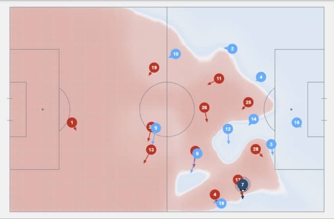
 For instance, let’s say that one of our clients has an upcoming game
against Paris Saint-Germain and wants to assess the unique threat that
Angel Di Maria poses on the ball. Their analyst could select ‘ball
drives’ in the event selector, add ‘sucessful’ and ‘next event in box’
in the filters to see the most dangerous ball drives the Argentine has
attempted. From the colour scheme and wedge length, the analyst can
see that Di Maria’s longest and most prevalent successful ball drives
occur between 310˚ and 350˚. The analyst can therefore back up their
hunch that Di Maria is at his most dangerous cutting in from the right
wing, clicking ball drives on the 2d pitch map linked to the video and
pitch
control map
to dive even deeper into their analysis.
For instance, let’s say that one of our clients has an upcoming game
against Paris Saint-Germain and wants to assess the unique threat that
Angel Di Maria poses on the ball. Their analyst could select ‘ball
drives’ in the event selector, add ‘sucessful’ and ‘next event in box’
in the filters to see the most dangerous ball drives the Argentine has
attempted. From the colour scheme and wedge length, the analyst can
see that Di Maria’s longest and most prevalent successful ball drives
occur between 310˚ and 350˚. The analyst can therefore back up their
hunch that Di Maria is at his most dangerous cutting in from the right
wing, clicking ball drives on the 2d pitch map linked to the video and
pitch
control map
to dive even deeper into their analysis.

 drives towards the box")
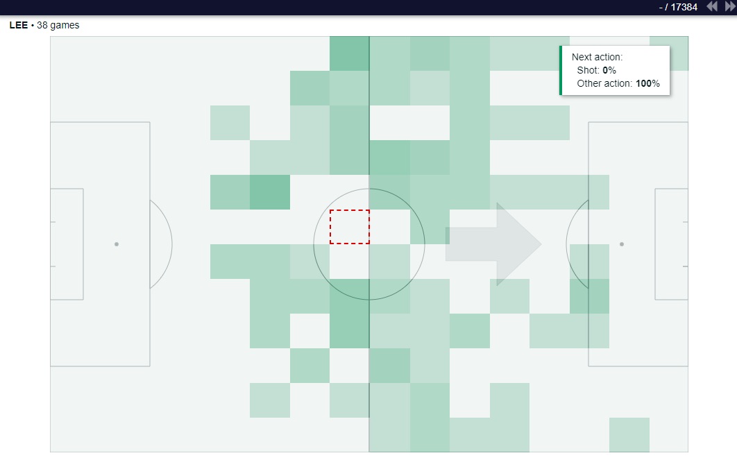
The Players Orientation widget can also be used with non-ball events. Now consider the same analyst, who now wants to prepare for an upcoming game against Lille by comparing their two striker options, Jonathan David and Burak Yilmaz. One way to do this would be to select ‘active ball callings’ in the Players Orientation dashboard and view in which direction do both players tend to make their runs which begin and end in the final third. The analyst could use the resulting wagon wheels to come up with a gameplan to play 3 technical centre-backs if David starts (so they are less easily pulled out of positions by his direct diagonal runs) and play 2 traditional physical centre-backs to combat the threat of Yilmaz’s shorter, powerful bursts.


Ultimately, this is a multi-faceted tool that everyone at Footovision is excited to unveil. Analysing a single player, a whole team, comparing two teams for one or several games is a remarkable amount of power to weild at one’s fingertips. If you are curious about this widget or any other innovative technology that Footovision has developed, feel free to contact us on our website to book a free demo with our experts.